Image

Geopotential height of the SH polar vortex has Positive correlation with the AAO

An incredible correlation between vertical geopotential height and the phase of the AAO.

Amazing l have never noted that before. A light bulb moment.

When geopotential height between surface to 100 hPa is positive . The AAO index is negative.
When geopotential height between surface and 100 hPa is negative. The AAO index is positive.

Some convincing proof that the condition of the polar vortex affects our weather.
I will put this geopotential height anomaly in the polar vortex on my weekly observation  round.

https://www.cpc.ncep.noaa.gov/products/precip/CWlink/daily_ao_index/hgt.aao.shtml

timeseries june to sept pv geoht

Image

Murray-Darling catchment

The Murray–Darling Basin is the largest and most complex river system in Australia. It runs from Queensland, through New South Wales and the Australian Capital Territory, Victoria and South Australia, spanning 77,000 kilometres of rivers, many of which are connected.

Towns and rural communities across the Basin rely on a healthy river system—our economy, food security and well being depend on it, now and into the future.

https://www.mdba.gov.au/discover-basin


Please scroll down to comments below for further information, comments or latest news on climate and the basin.

Click on the heading to load if necessary

Image

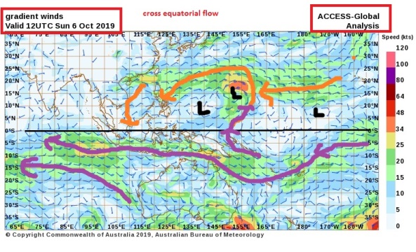
Cross equatorial winds

Winds don’t always stay in the same hemisphere . They do cross over in places across the equator 0 deg latitude.In both directions

I am starting this topic thread to investigate the flow of major wind streams from the Southern Hemisphere: SH and into the Northern hemisphere: NH   and vice versa ….in all seasons if l have the time.

I will capture the wind streams using ACCESS G model by BOM Australia

Greater Asia View because l am interested in the flow over Australia and across the equator

http://www.bom.gov.au/australia/charts/viewer/index.shtml?type=windbarb&level=gradient&tz=AEDT&area=DRSMC&model=G&chartSubmit=Refresh+View

Here is my first snap below. 8th September 2019. The first week of the Australian spring.

Notice how the winds from the southern cooler latitudes are conveyed up to the warmer northern mid , sub tropical and tropical latitudes.

You can see the importance of the high pressure cells , in particular the eastern flank, in transporting the cooler surface air to cool down the north latitudes.

The flow doesn’t stop here but continues into the NH in possible favorite more common spots along the equatorial line.

7th sept 2019 wind pattern asiaoz


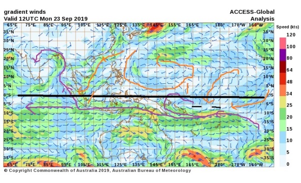
EQUINOX.. 23rd September 2019

There has been a significant change in direction of the NH wind streams this week. The major stream down past Korea  is on its way to the SH equator and some minor cross equatorial flow in the mid pacific atm

equinox 23rd sept 2019 wind asia


6thoct19 cross equatorial flow


Please go down to the comments section below for all further entries. Click on the heading to load if necessary.


Image

Indian Monsoon

Indian monsoon, the most prominent of the world’s monsoon systems, which primarily affects India and its surrounding water bodies. It blows from the northeast during cooler months and reverses direction to blow from the southwest during the warmest months of the year. This process brings large amounts of rainfall to the region during June and July.

Read on here

https://www.britannica.com/science/Indian-monsoon

5th sept_19 Indian monsoon

Indian meteorological society

Technical

http://www.imd.gov.in/pages/monsoon_main.php

Public

https://mausam.imd.gov.in/


All further information is in the comments section below.

Click on the title to load if necessary

Image

New understanding of the drivers behind hot and dry conditions over Australia’s north-east

Posted by BCG on 14th March 2019

http://www.climatekelpie.com.au/index.php/2019/03/14/new-understanding-of-the-drivers-behind-hot-and-dry-conditions-over-australias-north-east/

Predicting temperature extremes and dry conditions over spring and summer is vital for agriculture, water supplies, bushfire risk and human health. But to make accurate predictions the Bureau of Meteorology needs to better understand the climate drivers behind such extremes.

Bureau researchers have recently identified how wind patterns in the stratosphere around Antarctica can drive hot and dry conditions over southern Queensland and northern New South Wales.

This research was undertaken by the Forewarned is Forearmed (FWFA) project, which is part of the Federal Government Rural R&D for Profit program. FWFA is supported by the Bureau, a range of Rural R&D Corporations, Universities and state government agencies.

While most weather systems like storms, rain and high pressure systems are found in the troposphere, the relatively turbulent first layer of the atmosphere, the stratosphere above it is known for its stable air flows. Commercial airplanes target this layer to find jet streams for a smooth and efficient flight.

A key feature of the stratospheric circulation is the development of the wintertime polar vortex, whereby Antarctic circumpolar westerly winds (extending up to 40-50 km altitude) seasonally strengthen from autumn to winter as the polar cap region seasonally cools. The vortex weakens and breaks down during late spring as the polar cap warms up. In some years the vortex warms up and breaks down early, which can lead to hot and dry conditions on Australia’s surface during late spring-summer.

The early weakening of the polar vortex results in a strong downward air flow and a lack of clouds over eastern Australia (Figure 1) via another large-scale circulation that Australian farmers already know – a negative Southern Annular Mode (SAM) according to Bureau researcher Dr Eun-Pa Lim.

“A negative SAM is responsible for bringing hot and dry conditions to eastern Australia in our warm seasons” says Dr Lim. “Anything we can do to improve our ability to predict SAM will help people on the land to prepare for and manage these conditions. The long time–scale of the polar vortex weakening, which spans several months, means if we can capture it in our model, we can potentially predict low SAM conditions during late spring as early as late winter.”

Figure 1. A strong weakening of the polar vortex and the associated negative Southern Annular Mode leads to an abnormally strong downward air flow and a lack of clouds (orange indicates less than average cloud cover) over eastern Australia, which results in higher than average temperatures and dry conditions. This plot shows the cloud cover variation in late spring-early summer following the early break down of the polar stratospheric vortex.

But just what is a polar vortex and how does it influence Australia’s climate?

The abnormal weakening of the polar vortex and its downward coupling in spring to summer can be visualised in Figure 2. During winter the westerly winds associated with the SH polar vortex are stronger than usual in the upper stratosphere (as shown in orange), which can allow more atmospheric waves to propagate from the lower atmosphere into the stratosphere. Because these vertically propagating waves act to weaken the upper stratospheric westerlies, the polar vortex starts to weaken from early spring. As the vortex weakens over time, the weakening signal descends (shown in blue). The impact is felt at ground level from October to January.

Figure 2. When the abnormal polar vortex weakening happens, generally the vortex is abnormally strong during winter (shown in orange) and then weakens rapidly in spring. The process of weakening of the westerly winds descends after September (blue). Exact timings of the strengthening of the winter polar vortex and its subsequent weakening in spring to early summer can vary year-to-year.  Wind (m/s) is measured as being stronger or weaker than the average.

Impact on Australia’s climate

Developing an index to measure polar vortex weakening and strengthening has been a vital part of the Bureau’s recent research and has made it possible for them to study the impact of these events on Australia’s seasonal conditions.

“The Bureau has developed the stratosphere-troposphere (S­‑T) coupled mode index to identify these events and quantify their strength,” says Dr Lim. The index is based on monthly average wind data (1979-2017) over the Antarctic sub-polar region (55° to 65° South) at all available vertical levels from the surface to 50km altitude.

The index allows the Bureau to measure whether the polar vortex weakening is progressing at its usual pace. A high index means unusual weakening which leads to faster vortex breakdown. The strongest weakening event occurred in 2002 (Figure 3), which was related to the strongly negative SAM in spring 2002 that is believed to have played a more important role in driving hot and dry conditions than the relatively weak El Niño observed in the same year.

Figure 3. The Bureau have developed the S-T coupled mode index to identify polar vortex weakening (in red) and strengthening (in blue) events. The strongest vortex weakening event on record occurred in 2002 (based on monthly average wind data from April 2002 to March 2003 compared to wind data of all years).

Hot conditions

The Bureau’s S-T coupled mode index also highlights other less dramatic, but still significant, polar vortex weakening/strengthening events. By comparing historic temperatures and rainfall for the October to January period with the index the Bureau have found a very strong correlation between the polar vortex weakening and hot and dry seasonal conditions in southern Queensland and northern NSW.

For instance, maximum temperatures (Tmax) in the nine polar vortex weakening years (Index ≥ 0.8) were 1.2°C to 1.8°C warmer over southern Queensland and northern NSW than in the other 29 years studied between 1979 and 2017 (Figure 4). At the same time rainfall was 0.4 to 1.2 mm per day lower; that’s around 12 to 36mm a month.

Figure 4. The October to January mean maximum daily temperature is between 1.2°C and 1.8°C warmer and rainfall is 0.4 to 1.2 mm/day lower over southern Queensland and northern NSW during the nine identified polar vortex weakening years than in all the other 29 years.

“When you consider the seven hottest years (the top 20 per cent) – they are over four times more likely to occur when it is a polar vortex weakening year than a non-weakening year,” says Dr Lim.

“The research demonstrates that the Antarctic polar vortex is an important driver of heat and rainfall extremes in subtropical eastern Australia during late spring to summer.”

“The Bureau’s new ACCESS-S seasonal forecast system has a high level of skill in predicting S-T coupling from the beginning of September, which will improve our ability to predict temperature and rainfall extremes for the spring and early summer in polar vortex weakening years,” she said.

This result of the Bureau’s research implies that if land managers can be warned in September that they are likely to face hot and dry conditions through to January due to the polar vortex weakening, it will put them in a better position to make timely decisions such as how to manage livestock numbers, pastures and their supply of supplementary feed.

Lastly, since the beginning of spring 2018 the stratospheric polar vortex has been stronger than usual, which is likely to have somewhat mitigated the hot and dry conditions promoted by the development of El Niño over Queensland and northern NSW. This was something we could be thankful for during the tough dry spring of 2018”

Eun-Pa Lim, 03 9669 4000, eun-pa.lim@bom.gov.au

Image

Volcanoes and global cooling

Found this amazing essay published on National geographic

Colossal volcano behind ‘mystery’ global cooling finally found

The eruption devastated local Maya settlements and caused crop failures around the world

https://www.nationalgeographic.com/science/2019/08/colossal-volcano-behind-mystery-global-cooling-found/?cmpid=org=ngp::mc=social::src=twitter::cmp=editorial::add=tw20190823science-colossalvolcanomystery::rid=&sf218005129=1


Some extracts

The ices of Greenland and Antarctica bear the fingerprints of a monster: a gigantic volcanic eruption in 539 or 540 A.D. that killed tens of thousands and helped trigger one of the worst periods of global cooling in the last 2,000 years. Now, after years of searching, a team of scientists has finally tracked down the source of the eruption.

The team’s work, published in Quaternary Science Reviews, lays out new evidence that ties the natural disaster to Ilopango, a now-dormant volcano in El Salvador. Researchers estimate that in its sixth-century eruption, Ilopango expelled the equivalent of 10.5 cubic miles of dense rock, making it one of the biggest volcanic events on Earth in the last 7,000 years. The blast was more than a hundred times bigger than the 1980 Mount St. Helens eruption and several times larger than the 1991 eruption of Mount Pinatubo. It dealt the local Maya settlements a blow that forever altered their trajector……

el salvador


Ice cores from Greenland and Antarctica show spikes of sulfate, a byproduct of large volcanic eruptions, at 536 and either 539 or 540. The two volcanoes were so large and so violent, they launched sulfur gases and particles miles into the sky. Since this material reflected sunlight away from Earth’s surface, it triggered severe global cooling: One 2016 study found that the volcanoes decreased average global temperatures by as much as 3.6 degrees Fahrenheit……

……

geologists published new evidence that the historical “dust veil” of 536 was caused by a volcano. In the other, researchers announced that the Tierra Blanca Joven extended into marine sediments off the coast of El Salvador. The Tierra Blanca Joven eruption was even bigger than Dull and others thought.…….

………..

Dull’s team also revised their estimate of Ilopango’s size, taking into account the thickness and spread of Tierra Blanca Joven deposits. They say that Ilopango may have even dwarfed the 1815 Tambora eruption, a huge volcanic event that ushered in “a year without a summer” because of the global cooling it caused. Ilopango likely launched up to a million tons of sulfur miles into the sky, high enough for stratospheric winds to spread the aerosols worldwide and trigger global cooling.…..


The actual Research paper

https://www.sciencedirect.com/science/article/abs/pii/S0277379119301465

Radiocarbon and geologic evidence reveal Ilopango volcano as source of the colossal ‘mystery’ eruption of 539/40 CE

https://doi.org/10.1016/j.quascirev.2019.07.037


Image

weatherforum.com.au

A brand new Australian weather forum has opened… August 2019

as a replacement for the now defunct weatherzone forum .Weatherzone forum closed in JULY 2019 .

Paul Atkins is the author and administrator.

I go on there myself with username ‘crikey’

I encourage you to join and help build this forum with regular posts

Check it out here.. Its free.. Just register and start posting

https://www.weatherforum.com.au/Forum/

(Don’t forget the .au or you will end up in an overseas address.There are quite a few forums with a similar address)

front door


Pauls’ ABOUT page says

” WeatherForum.com.au forum is created and hosted by the same people who created OceanViewWeather.com.au and came about due to the closing of the WeatherZone forum in mid 2019. (Although we were a couple of months late!!!)

I am an IT manager, who feels the need to get back on the tools and play with things, like this forum, just to keep the old brain cells engaged!

We are a non commercial site created by a weather enthusiast for Weather enthusiasts.

We aim to create a forum where people can express their own opinions, however we expect users to respect other users as people and avoid conflict and trolling. To help with this we utilise various spam filters and profanity filters. This should help make the WeatherForum a place for young and old to enjoy.

(We is myself and Gemma the cat, who walked on the keyboard whilst the forum was being created)”

Rain trends vs -ENSO-IPO: Manilla NSW by surlybond

From 1999, rainfall at Manilla NSW matched ENSO only up to 2011, before the IPO became positive. This graphical log compares the rainfall at Manilla NSW with the El Niño-Southern Oscillation (ENSO) and the Inter-decadal Pacific Oscillation (IPO) through the 21st century to date. Values shown are anomalies, smoothed. (See Notes below on “Data”, “Smoothing”, […]

via 21-C Rain-ENSO-IPO: Line graphs — climate by surly

Image

Latest Computer climate modeling producing more fear

https://www.wunderground.com/cat6/New-Models-Point-More-Global-Warming-We-Expected?cm_ven=cat6-widget


New Models Point to More Global Warming Than We Expected

August 6, 2019, 12:09 PM EDT

Our planet’s climate may be more sensitive to increases in greenhouse gas than we realized, according to a new generation of global climate models being used for the next major assessment from the Intergovernmental Panel on Climate Change (IPCC). The findings—which run counter to a 40-year consensus—are a troubling sign that future warming and related impacts could be even worse than expected.

One of the new models, the second version of the Community Earth System Model (CESM2) from the National Center for Atmospheric Research (NCAR), saw a 35% increase in its equilibrium climate sensitivity (ECS), the rise in global temperature one might expect as the atmosphere adjusts to an instantaneous doubling of atmospheric carbon dioxide. Instead of the model’s previous ECS of 4°C (7.2°F), the CESM2 now shows an ECS of 5.3°C (9.5°F).

“It is imperative that the community work in a multi-model context to understand how plausible such a high ECS is,” said NCAR’s Andrew Gettelman and coauthors in a paper published last month in Geophysical Research Letters. They added: “What scares us is not that the CESM2 ECS is wrong…but that it might be right.”

At least eight of the global-scale models used by IPCC are showing upward trends in climate sensitivity, according to climate researcher Joëlle Gergis, an IPCC lead author and a scientific advisor to Australia’s Climate Council. Gergis wrote about the disconcerting trends in an August column for the Australian website The Monthly.

Researchers are now evaluating the models to see whether the higher ECS values are model artifacts or correctly depict a more dire prognosis.

“The model runs aren’t all available yet, but when many of the most advanced models in the world are independently reproducing the same disturbing results, it’s hard not to worry,” said Gergis.

A potential upending of a four-decade consensus

The IPCC issues comprehensive climate assessments every few years, along with interim reports on special topics in between. The IPCC’s Sixth Assessment Report (AR6) will be written over the next several years and released in 2021-22, based on papers being published through the end of 2019.

Back in 1979, a landmark U.S. climate study informally called the Charney Report estimated that the planet’s equilibrium climate sensitivity was between 1.5°C and 4.5°C. Each of the IPCC’s five major assessments since 1990 has largely agreed with this conclusion, although a few individual models have gone outside the range.

The consensus range of equilibrium climate sensitivity (ECS) from each of the IPCC's five assessment reports released since 2000, plus values from NCAR models
Figure 1. The consensus range of equilibrium climate sensitivity (ECS) from each of the IPCC’s five assessment reports released since 2000. Model assessment is still under way for the sixth report, due in 2021-22. Also shown are ECS values for each of the models contributed by the National Center for Atmospheric Research (NCAR) since the third IPCC report in 2001, as well as the value for the NCAR Community Earth System Model, version 2 (CESM2), which is being used in the next IPCC assessment. Image credit: Values drawn from archived IPCC asssessments. Note: This image has been updated to add the CESM1 value and correct the CESM2 value.

It does indeed look like many of the latest models will have ECS values higher than the IPCC ‘likely range’ of 1.5-4.5°C,” said Peter Cox (University of Exeter) in an email. “It seems that the new models with high ECS have more low-level cloud that tends to burn off under climate change, producing an amplifying feedback on warming.”

Cox is lead author of a 2018 study in Nature that examined temperature variability around long-term warming. The study concluded that the odds of ECS going outside the long-accepted range of 1.5-4.5°C were very small. “It is worth noting that observational constraints from both the temperature trend and temperature variability still suggest ECS of around 3°C,” said Cox. “So climate science has a conundrum to solve here.”

Clouds in the picture

Cloud-related effects have long been one of the biggest question marks in projecting future climate change, apart from uncertainties in future greenhouse emissions that hinge on human behavior. Low clouds—especially marine stratocumulus, which cover huge swaths of tropical and subtropical ocean—are especially crucial, as they tend to cool the climate by reflecting large amounts of sunlight.

Instruments aboard NASA's CERES satellite analyze Earth’s total radiation budget
Figure 2. Instruments aboard NASA’s CERES satellite analyze Earth’s total radiation budget and provide cloud property estimates that enable scientists to assess clouds’ roles in radiative fluxes from the surface to the top of the atmosphere. Image credit: NASA.

The recent concerns about low-level clouds have been reinforced by ongoing work at NASA drawing on data from the CERES satellite program (Clouds and the Earth’s Radiant Energy System). Measuring the amount of energy entering and leaving the top of Earth’s atmosphere, CERES data shows that net energy in the atmosphere and oceans has climbed steadily with the increase of human-produced greenhouse gases—including both during and after the so-called “hiatus” in global temperature from about 2000 to 2013, when the oceans took up extra energy.

After 2013, the eastern Pacific saw a major drop in low cloud cover, global air temperatures spiked, and “there was a huge increase in sea surface temperatures,” said CERES principal investigator Norman Loeb, who outlined the changes in a 2018 paper.

Loeb is now analyzing how well the models for the upcoming IPCC report—with the higher sensitivities in place—can reproduce cloud cover and air temperature during and after the hiatus, given sea surface temperature. He discussed initial results last month at the 27th IUGG General Assembly (International Union of Geodesy and Geophysics), held in Montreal.

According to Loeb, “some of the models do really darn well” in depicting the cloud changes of the past two decades. He cautions: “I don’t know how far you can extrapolate this. There’s a danger in saying ‘you take the current record and the models nail it, therefore they have the climate sensitivity right.’ I’m cautious about making that leap, but it’s intriguing that they are nailing that post-hiatus difference.”

Changes in SST and top-of-atmosphere radiation reflected from low clouds during vs. after hiatus
Figure 3. Differences in sea surface temperatures (left) and in CERES/MODIS-observed energy reflected from low clouds at the top of the atmosphere (right) between the so-called “hiatus” period of dampened surface air temperature increase (defined here as July 2000 – June 2014) and the subsequent period of amplified air temperature increase (July 2014 – June 2017). The post-hiatus period saw a dramatic increase in surface temperature across much of the eastern Pacific, together with a marked decrease in low-level cloud cover. Image credit: Courtesy Norman Loeb.

A 2019 study in Nature Geoscience that used a fine-scale cloud dynamic model found that marine stratocumulus could be depleted in large amounts if carbon dioxide levels were to reach about four times their current values, possibly triggering up to 8°C in additional global warming. See the post from last May by Dr. Jeff Masters on this paper.

Clouds and pollutants

The new NCAR model is based on tests of nearly 300 model configurations, with a focus on how well the models simulated pre-industrial climate and how well they reproduced the main global temperature trends of the last century. These trends include warming from 1920 to 1940, a period of roughly steady global temperature with regional cooling in the mid-20th century, and a more sustained global warming since the late 20th century.

The model also took into account new estimates of aerosol emissions (soot and other particles and droplets). These estimates were designed to be employed by all of the latest IPCC model configurations. Aerosol pollution tends to cool the climate overall, both by blocking sunlight directly and by serving as nuclei for clouds that block sunlight more effectively.

The new data on aerosol emissions led to a stronger cooling effect in the NCAR model than previous versions. However, the stronger aerosol-related cooling also led to an unrealistic portrayal of 20th century climate. When the model was reconfigured in response, it produced a more accurate reproduction of 20th- and 21st-century climate, including cloud behavior—but with a higher ECS, which pointed to a more ominous portrayal of future change.

If the higher ECS in the new models turns out to be on the right track, “it’s really bad news,” said Gettelman. “It means we are going to be on the warm end of projections, with larger impacts for any given emissions trajectory.”

A durable index

The ECS allows for apples-to-apples comparison between the bare-bones climate models of decades ago and the far more sophisticated versions now in place. The ECS calculations begin with an instant doubling of carbon dioxide, whereas in our actual atmosphere, carbon dioxide is increasing gradually rather than all at once. The warming produced by the end of a more gradual doubling of CO2 rise is called transient climate sensitivity (TCS). “While TCS may be a better metric for comparison to observations and estimating near-term climate response…ECS has a long history as a convenient metric of future climate change,” said the authors in their GRL paper.

The amount of carbon dioxide in the atmosphere has increased by about 45% during the rapid industrialization of the last 150 years. Since regular measurements began atop Mauna Loa, Hawaii, CO2 concentrations have increased from about 315 parts per million in 1957 to around 410 ppm today. Fossil fuel burning and other human activities generate more than 35 billion tons of airborne CO2 a year, about half of which stays in the atmosphere for more than a century.

Although other human-produced greenhouse gases warm the planet—methane molecules, in particular, are very powerful warming agents—CO2 is expected to account for most of the human-produced warming over the next few decades and beyond, as it remains in the atmosphere much longer than methane and is much more prevalent.

The Weather Company’s primary journalistic mission is to report on breaking weather news, the environment and the importance of science to our lives. This story does not necessarily represent the position of our parent company, IBM.

Image

Climate shifts…natural variation

I have started this blog post because today l have found out all major search engines are re routing the search string ‘climate shift’.

If you enter this term into any search engine, it will respond with pages and pages of ‘climate change’

We are being prevented from viewing alternative theories to man made climate change theories or facts, folks.

I will make an attempt to collect some links to climate regime shift sites that focus on natural variability.

I have tried alternatives to google and they ALL redirect the term ‘climate shift’

…You can get around this by..

Using google scholar…

which will accept the string ‘climate shift’ and lead you to alternative research on the reasons for global temperature trends other than AGW

or

on on the main google search engine page use talking marks on the search string which over rides the ban on the term… climate shift

“climate shift”